We were tasked with designing a new Headquarters for the Providence Journal with the added caveat that the basis for the project was off an existing section and plan from MVM Architect's competition entry for the new TAZ Building in Berlin, Germany.
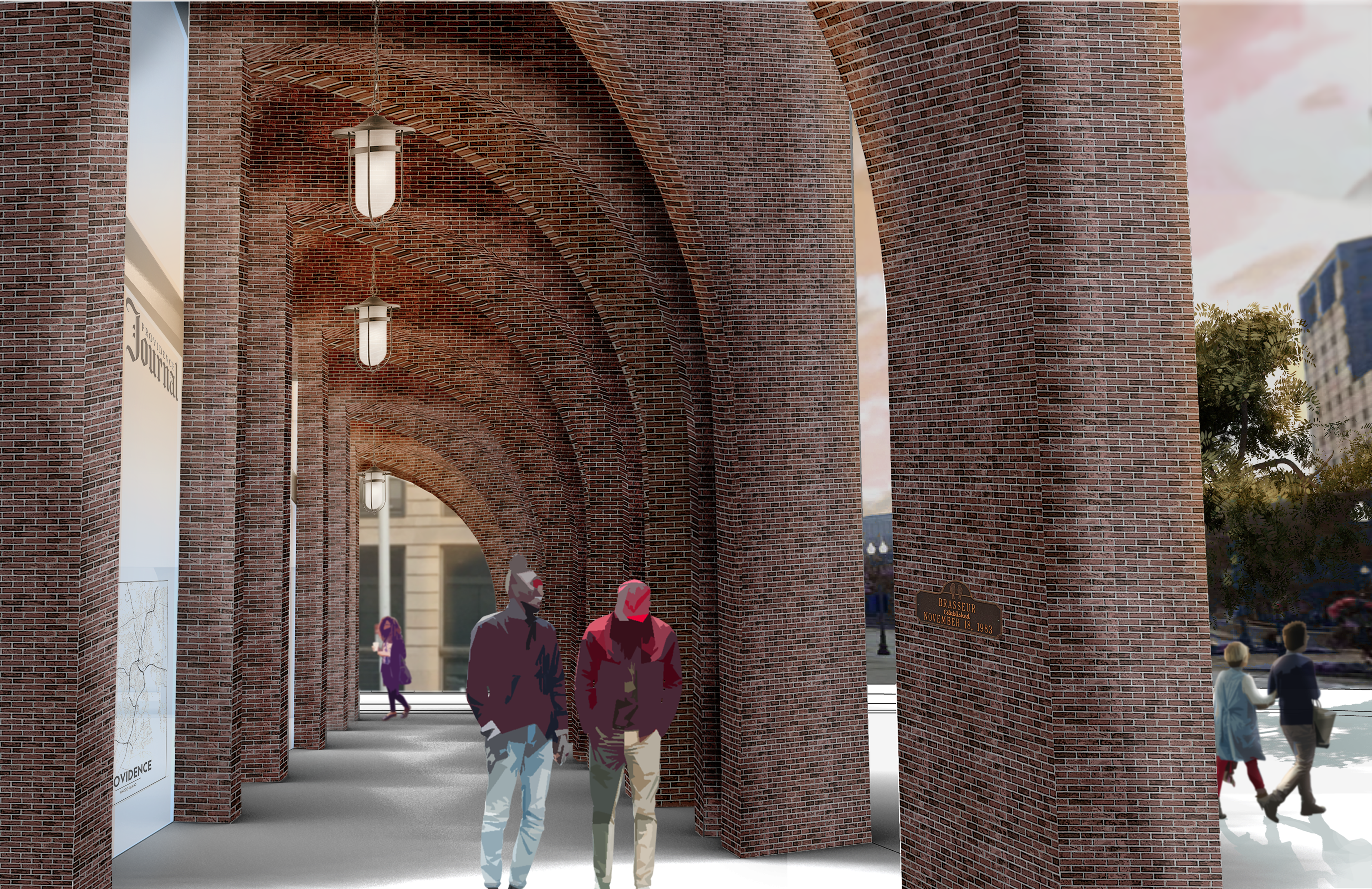
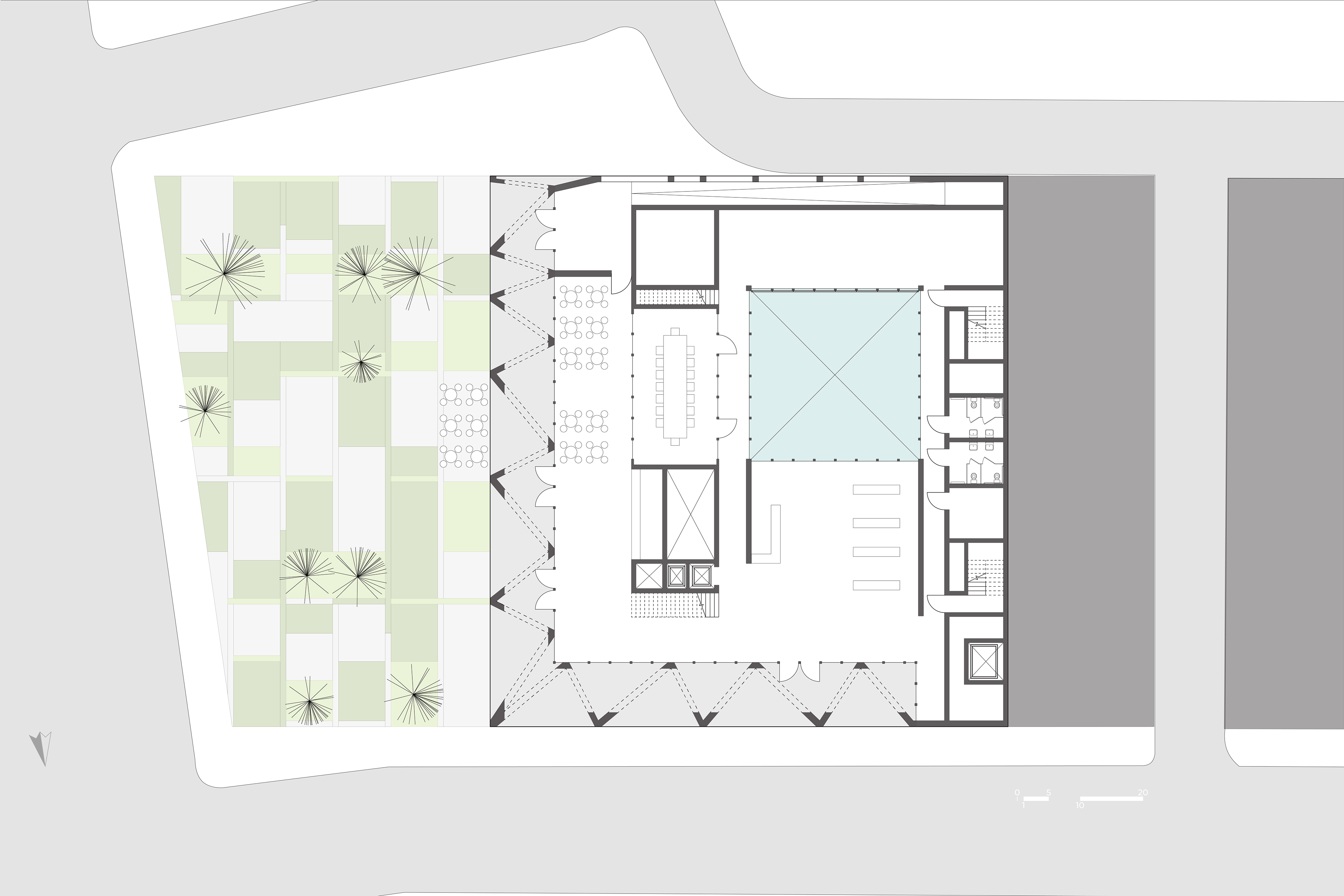
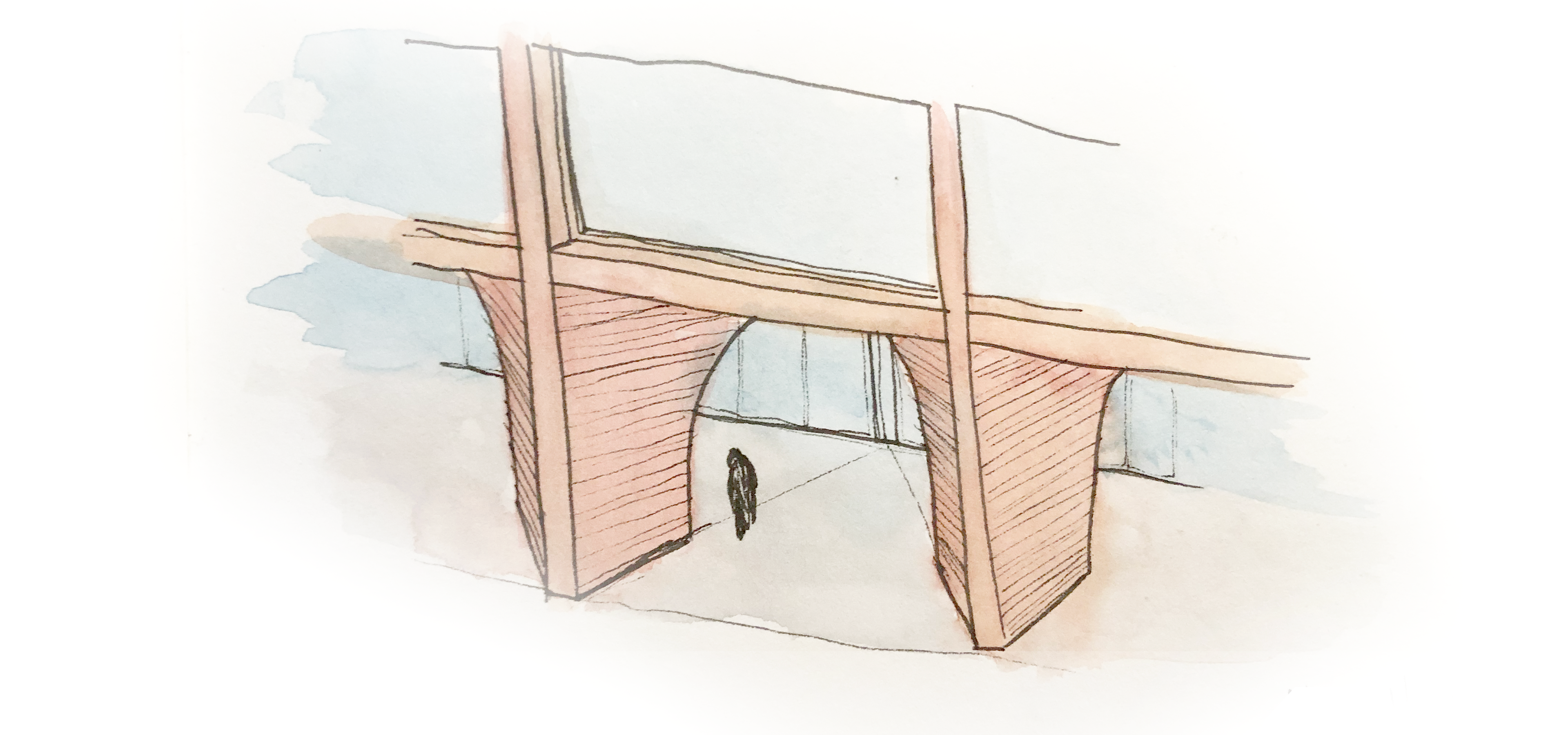
This project began with a study of the older buildings in downtown Providence in the effort to create a dialogue with the classically-dominated vernacular of the area. This study led to a modern vision of the tripartite division. In quoting the classical architecture surrounding the site, I decided to highlight the entry by creating an arcade. As I looked to integrate my design with the existing work, I found myself intrigued by the undulation of the interior volume, a mass had been carved from the building leaving in its wake a courtyard. Thus my arcade shifted to have a dialogue with this motion, whereas with the courtyard there was this push and pull in section, my arcade sought to create a similar undulation in plan. This manifested in a series of bays that hinged and folded. The regulating lines of the bays traveled upwards to define the planar concrete curtain of the second division of the façade, which can be seen in the basrelief model below. This created visual interest that attracted visitors and a modern expression of an ancient architectural element.
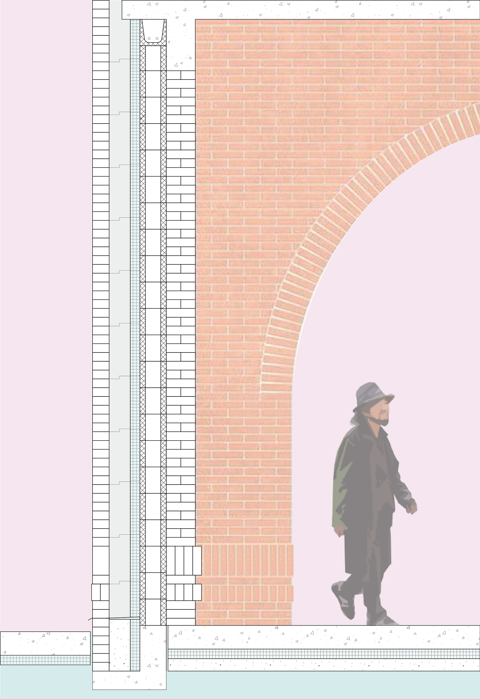
Section detail of the Providence Journal's arcade.

Basrelief model of the dual façades of the Providence Journal, the exterior and the interior respectively.
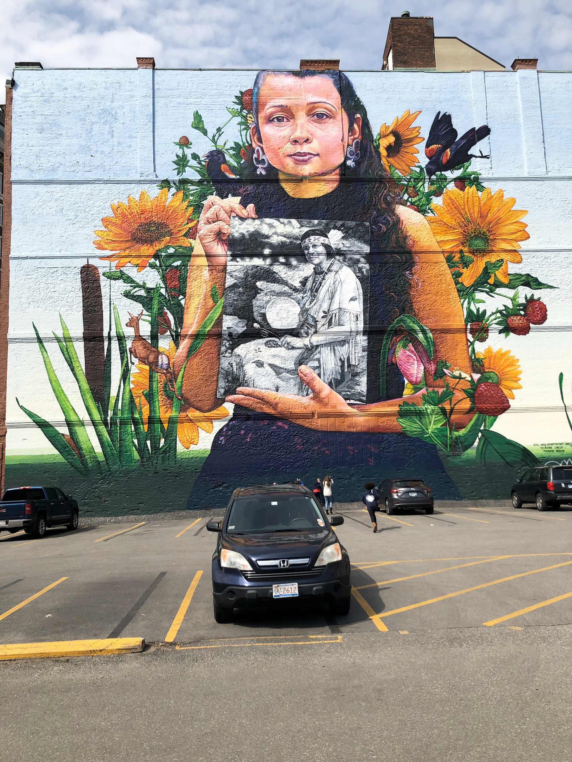
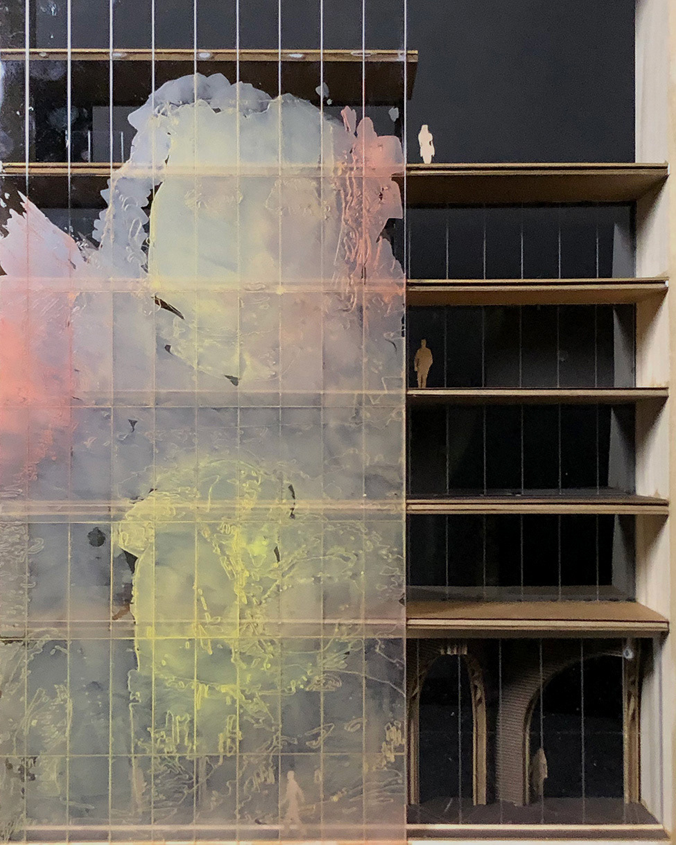
Gaia's 2018 mural Still Here pictured here with my car.
At the site, on a party wall with a neighboring building, was a beautiful mural that centers on indigenous erasure. I felt that rather than destroy this mural, the Providence Journal would prefer to celebrate it. To that end, the mural would be printed on a series of perforated metal panels that would wrap around the interior carved volume. The medium of perforated panels would allow for soft light to illuminate the interior while still allowing visitors to appreciate the mural, as demonstrated in the diagram on the left. Furthermore, I decided that the lower levels of the building would have a series of gallery and exhibition spaces to service the community. These spaces would include exhibits on Rhode Island’s indigenous history. The upper floors would consist of office spaces and breakout rooms radiating off the carved volume, the goal being for all work spaces to have a connection to the outside. In addition to that visual connection, the employees of the Providence Journal will have access to a series of balconies in the interior volume, to offer a contemplative space and a breath of fresh air.
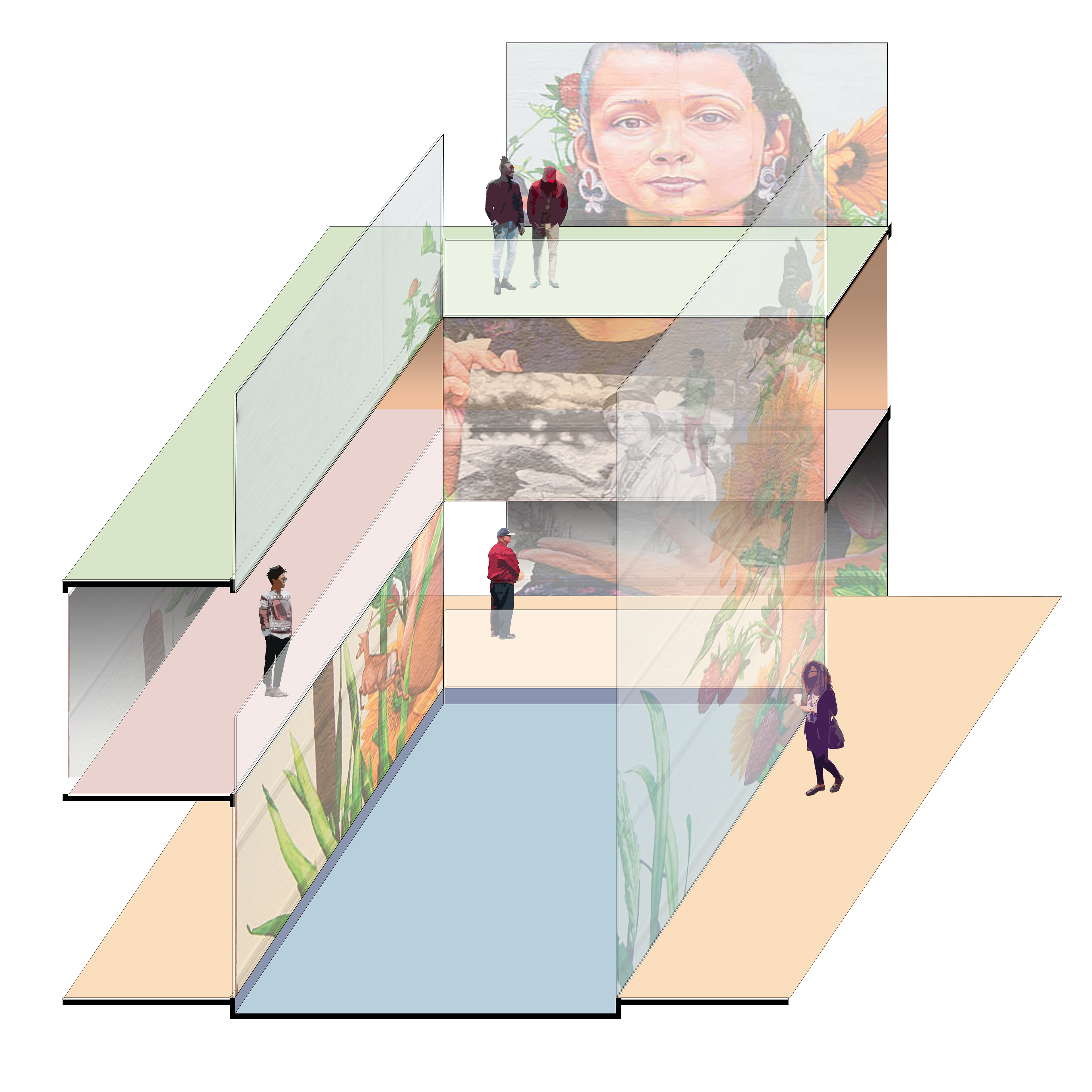
A diagram that shows how Gaia's mural wraps around the interior carved volume.
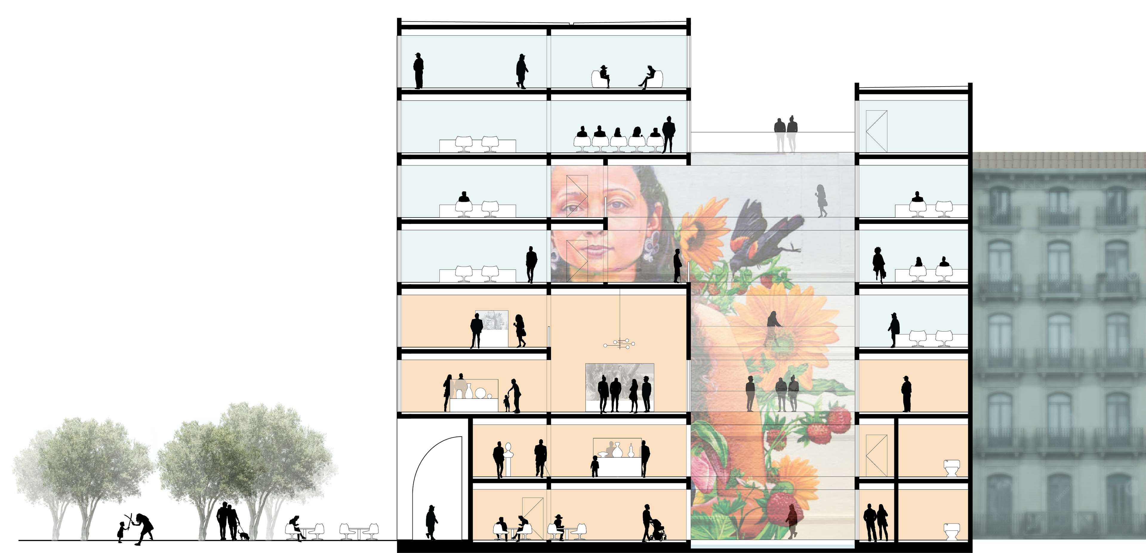
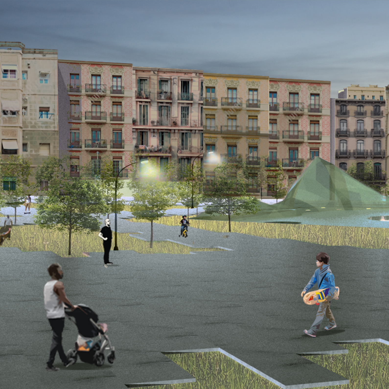
In the site section above, the colors denote the different program space, where the lower public levels in orange are the gallery and exhibit spaces and the blue levels above are the office and meeting spaces of the Providence Journal. Below is the site plan, where the lines and planarity of the façade descend to define the boundaries of the plaza.